
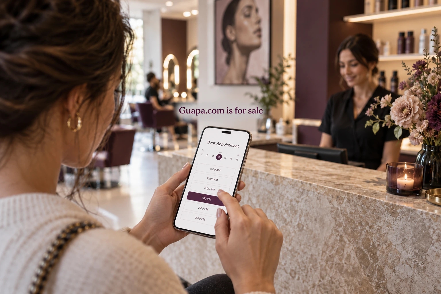
Salon websites often get redesigned when the real problem is a broken booking journey. Before you pay for a new visual system, walk the path a new client takes from recommendation to confirmed chair time. This article gives a five-step walkthrough, a staff tally method, diagnostic prompts, and a follow-up map. Use the walkthrough to identify specific booking problems before estimating their effect on appointments.
Five-step customer walkthrough
- Discovery: A friend texts the salon name. Can the client spell it and find the correct maps pin and site on the first try? When testing a name such as Guapa, record what the person types after hearing it once. Note whether Maps suggests a competitor first.
- Service choice: Does the site show services and duration without forcing an account? Hidden menus and PDF-only price lists create early exits. Note whether add-ons are explained before the client hits Book.
- Slot pick: Can the client see real availability? Placeholder calendars that later email “we’ll confirm” train people to abandon. Note timezone display if you take remote consults.
- Details: Name, phone, email, notes, deposit rules. Every extra field is a tax. Ask only what the chair needs. Note whether Facebook login is required for a guest.
- Confirmation: Immediate on-screen confirmation plus SMS or email with time, address, cancellation policy, and a reschedule link. Silence after submit is friction you own.
Worked example (illustrative): You walk a friend’s phone through “Guapa” as a two-chair color studio. Maps finds a competitor with a similar English name first: rename or claim the map listing. The site’s Book button opens a third-party widget that requires Facebook login: swap to guest checkout. Confirmation email lacks parking instructions: add one line. Each change addresses a problem the walkthrough exposed.
Run the walkthrough from a client’s starting point
Use a phone that is not yours. Use a network that is not the salon Wi‑Fi. Start from a text message, not from a bookmarked URL. Speak the name once to the tester; do not spell it unless a real friend would. Record every hitch in a shared note with screenshots. Time each step. A slot picker that takes four minutes on LTE is a finding even if it “works” on fiber at the front desk.
Run the walkthrough with three personas if you can: a first-time color client, a returning cut client, and a gift-card recipient. Gift-card paths often break when codes only work in-person or when the site has no redeem flow. Returning clients often bounce when login is mandatory for a simple rebook.
Staff tally method (one week)
If you lack analytics, use staff tallies for one week. Keep a paper or shared sheet with three columns: started booking / finished booking / called instead. Add a fourth column for “abandoned at…” with free text (maps, prices, login, deposit, confirmation). Keep the actual counts beside the notes rather than comparing them with an unrelated benchmark.
Prompts for the front desk:
- “Did you try to book online first?”
- “Where did it get stuck?”
- “Would you try again if we fixed X?”
Do not coach clients into praising the site. You want the stuck point. A week of honest tallies often shows that “we need a rebrand” was actually “the deposit page errors on iOS.”
Diagnostic prompts by step
Discovery: Is the Google Business Profile claimed? Does the name on the door match the profile? Are hours wrong? Is there a duplicate listing?
Service choice: Are durations honest? Do color services explain consultation rules? Is pricing a range with a reason, or a mystery?
Slot pick: Are blocked times real? Does the widget show stylist vs any-available? Can the client book the consultation without calling?
Details: Is card deposit explained before card fields? Is there a guest path? Are note fields optional?
Confirmation: Does SMS arrive within a minute? Does email include parking, entrance, and cancellation window? Is reschedule a link or a scavenger hunt?
Follow-up map
- T+0: Confirmation with essentials (time, address, policy, reschedule).
- T−24h: Reminder with arrival notes (parking, door code, what to wash or not wash).
- T+48h: Short check-in (“How did it feel?”) and a rebook link, not a survey novel.
- No-show: One polite recovery path with clear policy. Do not automate shame.
- Gift card: Separate path for balance check and booking with remaining credit.
Measure drop-off by counting how many people start booking versus finish, if your tool allows. Pair that number with the staff tally. If online finish rates are low but phone bookings are high, the site is training people to call, which may be acceptable for a two-chair studio and unacceptable for a multi-stylist shop trying to protect desk time.
Name and journey together
A consistent domain gives the client one address to look for. The booking widget still needs its own test. If you are evaluating Guapa.com for a salon brand, test speech and maps first, then the booking path. Fix the cheapest failures before commissioning new art. A soft name on a dead booking button still loses the client.
Common cheap fixes that outperform redesigns: claim the map listing, enable guest checkout, shorten the form, add parking to the confirmation, send the T−24h reminder, put prices on the page instead of a PDF. Common expensive fixes that can wait: custom illustration systems, brand films, and a homepage rewrite that never links to Book.
When a redesign is actually justified
Sometimes the journey is fine and the site still fails on trust: outdated photos of a renovated room, stylist bios from three years ago, or a homepage that never links to Book. In those cases, a focused content update beats a full visual system. Redesign when information architecture is wrong (services buried, policies invisible, or mobile type too small to tap), not when you are bored with the palette.
One practical order for reviewing the budget: (1) maps and NAP consistency, (2) guest booking path, (3) confirmation and reminder copy, (4) services and pricing clarity, (5) photography of the real room and team, (6) visual redesign. Review the earlier steps before investing in a visual redesign so the booking problems are included in the brief.
If you operate more than one location, run the walkthrough per location. Shared brands often inherit one broken widget template across cities. Fix the template once; verify each pin and phone number separately.
Next step
Run the five-step walkthrough on your own flow this week, log every hitch, and fix the cheapest failures before commissioning new art. If you are also weighing Guapa.com as the salon address, inquire with city, service focus, and the top friction you already found.